
Optimizing Shopify Navigation: A Comprehensive Guide for 2026
A customer arrives at your beauty store, curious and ready to buy. She's looking for a moisturizer, clicks on an unclear menu, lands on an irrelevant page, and leaves. This scenario repeats daily on thousands of poorly structured Shopify stores. A confusing journey can lead to up to 50% of customers abandoning their first navigation attempt. However, well-thought-out navigation transforms every visit into a conversion opportunity. This guide provides a step-by-step method to diagnose, restructure, optimize, and test your Shopify navigation, to offer a fluid, elegant, and truly high-performing experience.
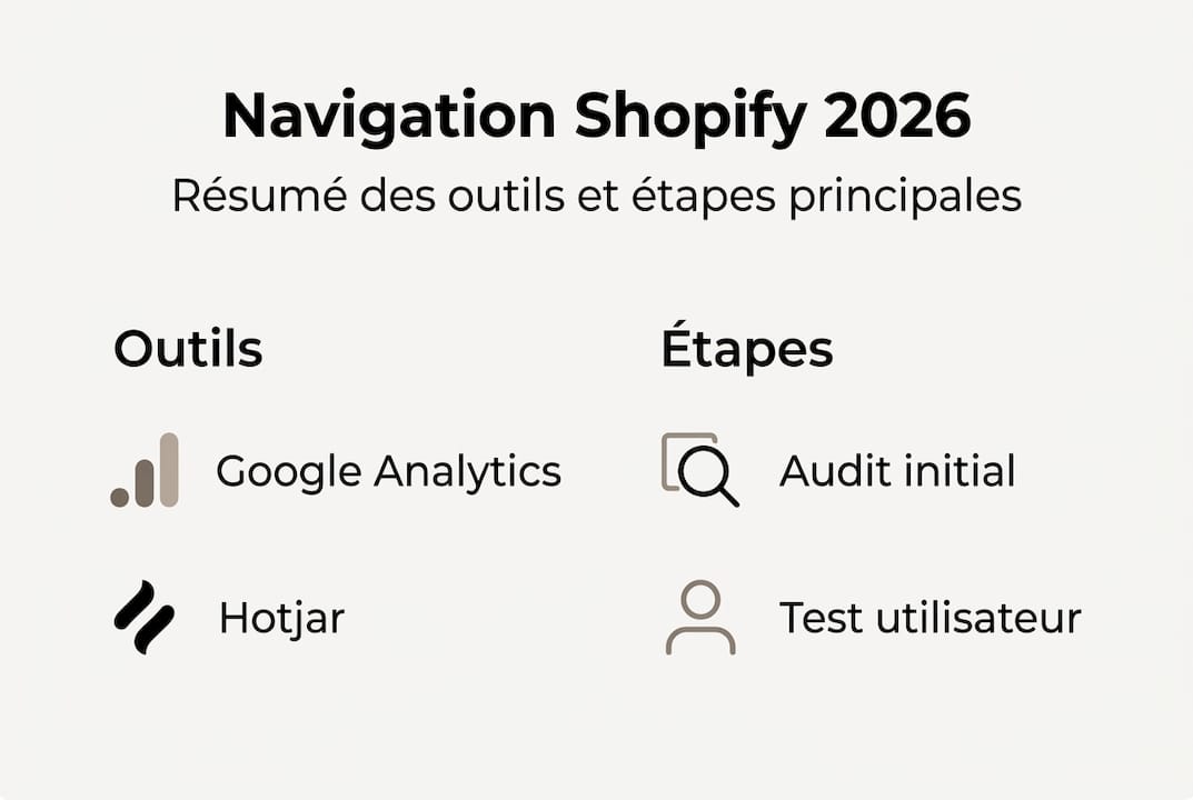
Table of Contents
- Identify the Weaknesses of Current Navigation
- Define the Ideal Site Structure for Your Sector
- Optimize Menus and Internal Search
- Test, Analyze, and Adjust Your Shopify Navigation
- Our Perspective: Dare to Be Simple to Optimize Your Shopify Navigation
- Entrust the Optimization of Your Shopify Navigation to Experts
- Frequently Asked Questions
Key Points
| Point | Details |
|---|---|
| Diagnose first | Start by auditing your navigation to target the real bottlenecks. |
| Winning logical structure | Adopt a clear site structure adapted to your beauty or wellness sector. |
| Simplified menus = conversion | A streamlined menu and efficient search facilitate the customer journey. |
| Test and adjust | Measure results and improve your navigation through user feedback. |
Identify the Weaknesses of Current Navigation
Before rethinking everything, you need to know what isn't working. The first audit must rely on UX tools and visitor behavior analysis to establish a solid diagnosis. Without this step, you risk correcting the wrong elements.
Here are the main signs that indicate faulty navigation:
- High bounce rate: visitors leave the site after a single page
- Frequent cart abandonment: the path to purchase is too complex
- Low product viewing rate: category pages do not convert into product visits
- Short session duration: users don't find what they're looking for
- Repeated internal search queries: a sign that navigation doesn't meet expectations
Several tools are available to help you identify these bottlenecks:
| Tool | Primary Use | Complexity Level |
|---|---|---|
| Google Analytics | User path analysis, exit pages | Intermediate |
| Microsoft Clarity | Heatmaps, session recordings | Easy |
| Hotjar | Surveys, heatmaps, funnels | Intermediate |
| Shopify Navigation Audit | Expert analysis of your store | Outsourced |
Once the data is collected, list your priority pages: homepage, category pages, cart page, and search results. These are the most common friction points in beauty and wellness stores.
Pro tip: Test the journey separately on mobile and desktop. Expectations and behaviors differ radically. A readable menu on a computer can become unreadable on a smartphone, and in the beauty sector, over 70% of visits come from mobile.
Define the Ideal Site Structure for Your Sector
Once weaknesses are detected, rethinking your navigation structure becomes the next key to guiding your visitors. A logical structure increases conversion and reduces frustration, allowing every visitor to find what they're looking for effortlessly.

There are several types of navigation depending on the size of your catalog:
| Navigation Type | Suited For | Advantages |
|---|---|---|
| Classic Navigation | Small ranges, single-product stores | Simple, quick to browse |
| Megamenu | Large ranges, multi-categories | Full catalog visibility |
| Contextual Navigation | Routines, rituals, specific needs | Guides based on purchase intent |
For beauty and skincare stores, contextual navigation is often the most effective. It organizes products by need (hydration, anti-aging, radiance) rather than by product type. For fashion, organization by collection or season works better.
Here are the steps to map out your ideal site structure:
- List all your existing products and categories without judgment
- Group them by user logic, not by inventory logic
- Limit depth levels to a maximum of two levels to avoid confusion
- Integrate your advice pages and buying guides directly into the main menu
- Ensure the contact page is accessible from every navigation level
Integrating a blog or buying guides into the site structure is often overlooked. Yet, these pages build trust and extend visit time. For stores considering a complete redesign, Shopify beauty navigation migration is a structural step to anticipate. Official Shopify navigation tips also recommend testing the site structure with real users before deployment.
Optimize Menus and Internal Search
With the ideal site structure in place, the next step is to fine-tune your menus and search function, the two main resources for guiding your visitors. A streamlined menu increases perceived efficiency by 34%, which directly translates to the conversion rate.
To design an effective menu, adhere to these fundamental principles:
- 5 to 7 maximum items in the main menu to avoid cognitive overload
- Clear and short labels: prefer "Face Care" to "Our Range of Face Care Products"
- Consistent category logic with your customer's shopping habits
- Adapted mega-menus if your beauty range exceeds 50 references
- Relevant filters: organic, vegan, routines, best-sellers, new arrivals
The internal search bar is often underutilized. However, visitors who use search have a much stronger purchase intent than others. Enable intelligent suggestions (autocompletion) and display enriched results with photos and prices. Up to 10% more conversion through personalization of search results is an accessible gain without major redesign.
For fashion stores, an effective Shopify menu follows similar logic but with entries by collection or style. In all cases, a well-executed Shopify navigation redesign should always start with real data from your visitors.
Pro tip: Regularly analyze the terms typed into your internal search bar. If a product frequently appears in queries but is not highlighted in the menu, it's a clear signal: reposition it in your site structure or create a dedicated entry.
Test, Analyze, and Adjust Your Shopify Navigation
Optimized menus and a well-structured site are not enough: the ultimate lever for improvement inevitably involves continuous testing and adjustment. Only 23% of stores adapt their navigation following user testing, which represents a significant competitive advantage for those that do.
Here are the most effective testing methods:
- Guided user journeys: ask 5 people to perform a specific task on your store and observe their blockages
- Heatmaps and recordings: visually identify where visitors click, scroll, and abandon
- A/B testing: compare two versions of your menu or category page to measure which converts better
- Funnel analysis: track the complete path from the homepage to checkout
- Post-visit surveys: ask a simple question ("Did you find what you were looking for?") to gather qualitative feedback
| Tool | Key Feature | Ideal For |
|---|---|---|
| Shopify Analytics | Navigation reports, popular pages | Daily tracking |
| Hotjar | Heatmaps, recordings, surveys | Behavioral diagnostics |
| A/B Navigation Test | Variant comparison | Continuous optimization |
| Shopify Micro-interactions | Analysis of subtle interactions | Advanced UX improvement |
"Tested navigation is the guarantee of a truly optimized experience."
After each test, focus on three priority metrics: bounce rate, conversion rate, and average time spent on category pages. If a variant improves these three indicators simultaneously, deploy it without delay.
Our Perspective: Dare to Be Simple to Optimize Your Shopify Navigation
After years of supporting beauty and wellness stores on Shopify, we've observed a recurring trend: brands that multiply subcategories believe they offer more choice. In reality, they create confusion. The paradox of choice is well-documented: too many options paralyze purchasing decisions.
We've helped beauty stores reduce their menu from 12 to 6 main entries. The result: a measurable increase in conversion rate from the first few weeks. No magic, just clarity.
The lesson we've learned is simple. Minimalist, well-thought-out navigation almost always outperforms exhaustive navigation. Your customers don't want to explore a catalog; they want to quickly find what meets their needs.
Pro tip: Have someone outside your industry review your menu. If they hesitate or ask questions, simplify. This test takes five minutes and often reveals problems invisible to those who know their store too well.
Simplicity is not a compromise. It is a requirement for performance.
Entrust the Optimization of Your Shopify Navigation to Experts
Optimizing the navigation of a beauty or wellness Shopify store requires expertise that combines UX analysis, industry knowledge, and technical mastery. At Tamara Agency, we have been supporting ambitious brands since 2018 with a tailored approach.

Our Shopify beauty services cover a comprehensive audit of your navigation, a Shopify navigation redesign according to best UX practices, and Shopify optimization training so your teams can take control of the tools. Each project is designed to maximize conversion while respecting your brand's identity. Let's discuss your store and together build navigation that both entices and performs.
Frequently Asked Questions
What are the main indicators of ineffective navigation on Shopify?
A high bounce rate, few pages viewed per session, and frequent cart abandonment signal that navigation needs to be reevaluated as a priority.
Is a megamenu absolutely necessary for a beauty store on Shopify?
No, simple and consistent navigation is often sufficient. A megamenu is mostly useful if the range is very broad, as current beauty navigation trends indicate.
How can I quickly test new navigation on Shopify?
Use tools like Hotjar or Google Optimize to gather user feedback before and after implementation. These navigation testing tools allow you to act on concrete data.
Can improving navigation boost my Shopify sales?
Yes, fluid navigation makes purchasing more intuitive. The link between navigation and conversion is direct and measurable from the first weeks of optimization.