


Optimizing E-commerce UX/UI: A Practical Guide to Shopify Conversion
TL;DR:
- UX/UI optimization significantly increases the Shopify conversion rate, often exceeding 3.2%.
- Preparation, clear architecture, and responsive design are essential for a high-performing store.
- A data-driven approach, involving regular tests and continuous improvements, is key for sustainable progress.
The average Shopify conversion rate hovers around 1.4%, but truly optimized stores exceed 3.2%. This difference isn't due to advertising budget or brand recognition; it almost always comes down to user experience. For beauty, fashion, and wellness brands, the challenge is twofold. It's about visual appeal while guiding the customer toward purchase without friction. This guide presents a structured approach, concrete methods, the right tools, and common pitfalls to avoid to transform your Shopify store into a true conversion engine.
Table of Contents
- Preparing E-commerce UX/UI Design
- Structuring Architecture and User Journey
- Designing UI for Conversion and Performance
- Testing, Validation, and Continuous UX/UI Optimization
- Our Perspective: What Beauty/Fashion Experts Never Tell You
- Go Further with Tamara Agency
- Frequently Asked Questions about E-commerce UX/UI Design
Key Points
| Point | Details |
|---|---|
| Strategic preparation | A UX audit and clear objective definition are essential for successful design. |
| Optimized architecture | Fluid navigation and a persuasive PDP maximize experience and conversions. |
| Mobile performance priority | Optimizing images and Lighthouse scores on mobile is vital to capture 70% of smartphone purchases. |
| Tests and evolutions | A/B tests and regular audits ensure continuous optimization and high conversions. |
| Expert support | Partnering with a specialized agency like Tamara Agency helps avoid errors and accelerate performance. |
Preparing E-commerce UX/UI Design
Before touching a single pixel, solid foundations must be laid. A UX/UI project without preparation is like a renovation without an architect's plan: you progress quickly at first, then spend a long time fixing mistakes. The preparation phase determines the quality of everything that follows.
Start by precisely defining your objectives. Do you want to increase the overall conversion rate? Improve brand image to justify premium prices? Reduce the cart abandonment rate? These objectives are not treated in the same way, and confusing them dilutes the effort.
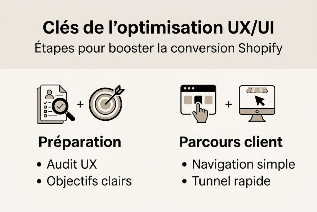
Next, the UX process begins with an audit of the existing system, a competitive benchmark, and a study of your customers' purchasing behaviors. Analyze your Google Analytics data, identify pages where visitors leave the site, and compare your navigation to that of your direct competitors. This step often reveals frictions invisible to the naked eye.
Essential tools for the preparation phase:
- Google Analytics 4 to analyze navigation flows and exit rates
- Hotjar or Microsoft Clarity for heatmaps and session recordings
- Figma or Adobe XD for creating wireframes and prototypes
- Semrush or Ahrefs for competitive SEO and UX benchmarking
- PageSpeed Insights to assess current technical performance
The question of templates versus custom design comes up systematically. For brands in the launch phase or with a controlled budget, an optimized Shopify design offers an excellent quality/performance ratio. For brands with specific requirements, a strong visual identity, or advanced functionalities like a diagnostic quiz or a routine builder, custom design is essential.
| Criterion | Template | Custom |
|---|---|---|
| Initial cost | Low to medium | High |
| Go-live time | 2 to 6 weeks | 2 to 5 months |
| Customization | Limited | Total |
| Initial performance | Good | Excellent if well-designed |
| Scalability | Moderate | High |
Beauty and fashion specifics require particular attention to high-definition visuals, product zoom features, lifestyle galleries, and decision-making tools. A Shopify performance checklist adapted to your sector will help you not forget anything.
Pro tip: Never launch a UX/UI project without having interviewed at least five real customers. Their words, hesitations, and expectations are worth more than any creative intuition.
Structuring Architecture and User Journey
Once the foundations are laid, the customer journey and your store's architecture must be built concretely. The goal: for every visitor to find what they are looking for in less than three clicks, without ever feeling lost.
Mapping your customers' actual flow is the foundational step. Mapping real navigation helps detect detours and frictions, then structure the key steps: research, wireframe, prototyping, and testing. Identify the main entry points (homepage, product pages via SEO, social media) and the most frequent exit points.
Steps to structure a frictionless journey:
- Map the 5 to 7 most visited pages and measure their bounce rate
- Identify frictions: overly long forms, confusing navigation, inconspicuous CTAs
- Simplify main navigation with a clear mega-menu and logical categories
- Integrate smart filters adapted to beauty/fashion shopping habits
- Create shortcuts to promotions and new arrivals from the homepage
Mobile is no longer an option. More than 70% of online purchases are made on smartphones, necessitating a mobile-first approach from design. Every navigation element, every button, every filter must be designed for a 6-inch screen before being adapted to the desktop.
The product page (PDP) is the moment of truth. This is where the visitor decides whether or not to buy. A high-performing beauty site combines HD images, lifestyle photos, technical packshots, visible customer reviews, and reassurance elements (delivery, returns, composition). Do not underestimate the impact of micro-interactions on conversion: a button that changes color on hover, an add-to-cart animation, a low-stock indicator. These details reassure and encourage action.

| PDP Element | Conversion Impact | Priority |
|---|---|---|
| HD multi-angle images | Very high | Critical |
| Visible customer reviews | High | High |
| Clearly visible CTA button | High | Critical |
| Delivery/return reassurance | Medium to high | High |
| Product video | Medium | Recommended |
The conversion funnel must be streamlined. Remove dead-ends, unnecessary redirects, and superfluous steps. An abandoned cart is not inevitable: a personalized reminder or a well-placed re-engagement offer can recover a significant portion of these lost sales.
Designing UI for Conversion and Performance
The architecture is set. Now it's about bringing it to life with a UI design that serves both conversion and your brand's identity. A site must perform as much as it seduces.
Alignment between UI and the brand's visual identity is non-negotiable. Colors, typographies, spacing, overall ambiance: every choice must reflect your brand's positioning. A natural cosmetics brand does not have the same visual language as a luxury fashion house. This consistency builds trust and reduces bounce rate.
Priority UI elements for conversion:
- Call-to-action buttons contrasted and positioned above the fold
- Legible typography on mobile, minimum 16px font size for body text
- Generous spacing between elements to avoid visual overload
- Consistent color palette with 1 to 2 accent colors maximum
- Trust badges (certifications, press, influencers) integrated naturally
Technical performance is inseparable from design. Prioritizing a Lighthouse score of 60 or higher on mobile for key pages (homepage, product list, product page) is imperative. This involves optimizing images with the WebP format, lazy-loading, using a CDN, and deferred loading of non-critical JavaScript.
Key figure: A one-second improvement in loading time can increase the conversion rate by 7%. For a store generating €50,000 per month, that's €3,500 in additional revenue without spending a euro on advertising.
Motion design applied to beauty is an often underutilized lever. Light animations on page transitions, subtle parallax effects on banners, micro-animations on forms create a premium experience without heavy performance if well implemented.
Pro tip: Systematically test your design on an iPhone SE and a mid-range Android. If the experience is fluid on these devices, it will be excellent everywhere else.
Testing, Validation, and Continuous UX/UI Optimization
A well-designed plan is never static. Continuous optimization through testing and analysis is essential to stay ahead of the competition. The stores that progress the most are not those with the best initial design, but those that test most regularly.
Structured test plan in 5 steps:
- Define a primary KPI per test (conversion rate, CTA click-through rate, cart completion)
- Formulate a clear hypothesis based on existing data
- Launch only one test at a time to isolate variables
- Let the test run for at least two full purchase cycles
- Analyze results by segment (mobile/desktop, new/returning)
E-commerce tests cover several dimensions: mobile usability, order pages, product pages, homepage, and navigation. Each type of test reveals different information. Manual tests allow for the observation of qualitative behaviors, automated tests measure large-scale performance, and A/B tests compare two versions of the same element.
Regarding A/B testing, the golden rule is to define the objective and KPI before launching, prioritize tests on high-traffic pages, and segment the results. Absolutely avoid testing several variables simultaneously without sufficient traffic: false positives are common and can lead to bad decisions.
Benchmarks are your guide. The Shopify average is 1.4% conversion, the top 20% exceed 3.2%, and the top 10% reach 4.7%. Concrete cases illustrate this potential: the La Rosée brand saw a 53% increase in its conversion rate after a UX redesign focused on the PDP and cart. A luxury fashion house multiplied its turnover by 2.5 thanks to a minimalist and ultra-fast experience.
Implement continuous monitoring e-commerce beauty solutions: Google Analytics dashboards, alerts on conversion rate variations, quarterly audits of key pages. An effective Shopify conversion strategy is not a one-off project, it's a living process.
- Weekly heatmaps on high-traffic pages
- Monthly audit of the order funnel
- Quarterly review of KPIs with action plan
- Continuous A/B testing on at least one active variable
Our Perspective: What Beauty/Fashion Experts Never Tell You
After years of supporting beauty and fashion brands on Shopify, we've observed a truth few agencies admit: creative intuition alone is no longer enough. The market is too competitive, purchasing behaviors too fragmented to rely solely on "a sense of beauty."
The real difference between a stagnant store and a thriving one is the discipline of testing. The brands that achieve the best conversions are not necessarily those with the most elaborate design. They are the ones that regularly test their PDPs, carts, and homepages, and dare to adjust even when results contradict initial branding.
We say it clearly: a well-configured high-performing template is better than a custom-built one overloaded with untested features. Launch fast, measure early, adjust often. Custom solutions have their place, but only when data justifies every development choice.
The best beauty UX practices are not dogmas. They are starting points that your data must confirm or refute. It is this data-driven approach, combined with a strong aesthetic requirement, that produces lasting results.
Go Further with Tamara Agency
Moving from theory to a truly converting Shopify store requires expertise that few in-house teams fully possess. At Tamara Agency, we have been supporting beauty, fashion, and wellness brands since 2018 with an approach that combines aesthetic rigor and measurable performance.

Whether you need custom beauty store creation, an existing Shopify store redesign, or Shopify training to master conversion levers internally, we have the solution adapted to your stage of development. Contact us for an initial audit and discover concretely what your store is leaving on the table each month.
```Frequently asked questions about e-commerce UX/UI design
What is the difference between a Shopify template and a custom design?
A template allows for quick launch at a controlled cost, whereas a custom design offers total personalization, better scalability, and precise adaptation to your brand's specific features and business functionalities.
Which KPIs should be monitored to validate UX/UI performance?
The most critical are the conversion rate (the Shopify average is 1.4%), the mobile Lighthouse score, the speed of the checkout funnel, and the cart completion rate.
From what traffic volume should A/B tests be conducted?
It's better to wait until you have several tens of conversions per purchase cycle before testing a single variable at a time, to avoid false positives related to insufficient traffic.
How to optimize the mobile experience in beauty/fashion e-commerce?
Adopt a mobile-first design from conception, prioritize lightweight HD images in WebP format, visible buttons, a simplified funnel, and filters adapted to the mobile shopping habits of your beauty or fashion customers.
Which tools to use to test UX/UI after launch?
The most useful are Google Analytics 4, heatmaps (Hotjar, Clarity), native Shopify A/B tests or via third-party applications, and regular audits on the key pages of your purchase funnel.