


Shopify Motion Design: Boost Your Beauty Conversion
TL;DR:
- Motion design can increase conversions by up to 200% by guiding the user and reducing friction.
- Targeted animations, such as shade selectors and progress indicators, enhance engagement and trust.
- Successful integration relies on a structured approach, mobile optimization, and adherence to UX best practices.
Micro-animations can boost e-commerce conversions by up to 200%, yet most beauty brands ignore them or misuse them. Motion design isn't just about making a store look pretty; it's a strategic lever that guides the eye, reduces friction, and accompanies the buyer all the way to payment. In this article, we'll explain what motion design truly is when applied to Shopify, how it influences user experience and conversion, what mistakes to avoid, and how to concretely integrate it into your beauty store.
Table of Contents
- Understanding Motion Design in Beauty E-commerce
- The Impact of Motion Design on User Experience and Conversion
- Shopify Motion Design: Best Practices, Pitfalls, and Performance
- How to Concretely Integrate Motion Design on Shopify
- Our Perspective on Motion Design in Beauty E-commerce
- Grow Your Shopify Beauty Store with Tamaragency
- Frequently Asked Questions about Motion Design in Beauty E-commerce
Key Points
| Point | Details |
|---|---|
| Motion design boosts conversion | Strategic UX animations can increase the conversion rate of a Shopify beauty store by up to 200%. |
| Prioritize mobile performance | For lasting results, adapt motion design to mobile usage, which accounts for over 70% of beauty traffic. |
| Beware of cognitive overload | Excessive animations or videos can increase bounce rates and harm accessibility; moderate and test your choices. |
| Effective integration method | Use UX analytics (heatmaps) and implement animations via schema to maintain speed and engagement. |
Understanding Motion Design in Beauty E-commerce
Motion design, in the context of a Shopify store, refers to all the visual animations and transitions that structure the browsing experience. It's not a brand video or a simple decorative effect. It's a system of visual signals that guides the user, confirms their actions, and builds their confidence at each step of their journey.
For beauty and wellness brands, UX challenges are particularly demanding. Your customers want to feel the quality of the product even before touching it. A well-designed animation can convey this feeling. The most successful Shopify beauty designs consistently incorporate motion elements to create this emotional connection.
Here are the most effective uses of motion design in beauty e-commerce:
- 360° product views: allowing the user to rotate a bottle or set creates an immersion that reduces purchase doubt.
- Interactive shade selectors: a fluid transition between shades of foundation or lipstick improves purchasing decisions by making the choice tangible.
- Animated tutorials: micro-sequences that show the application of a skincare product or makeup increase the perceived value of the product.
- Loading animations: an elegant progress indicator reassures the user and reduces abandonment.
- Page transitions: smooth transitions between categories reinforce brand image consistency.
“A site must perform as well as it seduces.” This is precisely where motion design comes into its own: it is both an engagement tool and a performance lever.
The most advanced Shopify beauty solutions always combine aesthetics and functionality. Motion design is not an option reserved for large houses. It is a necessity for any brand that wants to convert effectively, regardless of its stage of development.
The Impact of Motion Design on User Experience and Conversion
The numbers speak for themselves. A beauty brand like FloraSoul recorded a +41% mobile conversion rate after a redesign that included targeted animations. This is not an isolated case. Well-placed animations activate precise psychological mechanisms that encourage purchase.
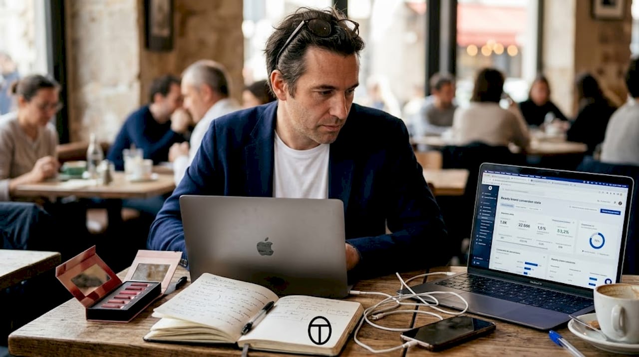
From a neurological perspective, animations trigger a slight dopaminergic response. When an animation confirms an action (add to cart, shade selection), the brain associates this visual reward with a positive experience. This association strengthens engagement and reduces hesitation.
Comparison of animation impact on key indicators:
| Indicator | Without motion design | With motion design |
|---|---|---|
| Mobile conversion rate | Reference | +41% (FloraSoul) |
| Checkout completion | Reference | +28% with progress indicators |
| Bounce rate | Reference | Significantly reduced |
| Time spent on product page | Reference | Increased |
The most measurable effects focus on three points:
- The checkout: animated progress indicators reassure the buyer about the progress of their order.
- The product page: animations for selecting variants reduce confusion and abandonment.
- The cart: a micro-animation when adding a product confirms the action and maintains purchase momentum.
+28% checkout completion with animated progress indicators. This is one of the most direct and measurable gains of motion design in e-commerce.
To further analyze your current performance, our conversion performance checklist allows you to quickly identify friction points to correct. The best Shopify beauty UX practices show that Shopify micro-interaction optimization is often the most underutilized lever by beauty brands.
Shopify Motion Design: Best Practices, Pitfalls, and Performance
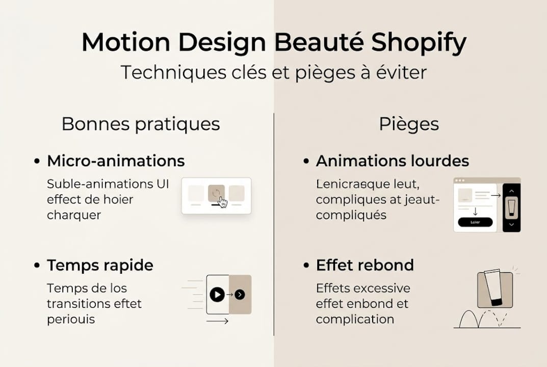
Integrating animations isn't enough. If poorly executed, they can produce the opposite effect. Over-animations cause cognitive overload, increasing bounce rates by 34%. Visual excess fatigues the user and distracts their attention from the essentials: the product and the purchase.
The most common pitfalls to avoid:
- Looped videos on the homepage: They slow down loading and cause 40% abandonment beyond 3 seconds. They also pose accessibility issues for people with vestibular disorders.
- Animations on all elements simultaneously: When everything moves, nothing guides. The eye no longer knows where to focus.
- Transitions that are too long: On mobile, an animation longer than 300ms is perceived as slowness, not elegance.
- Failure to respect "reduce motion" preference: Some users activate this option in their operating system. Not taking this into account is an accessibility error.
Comparison of animation approaches:
| Approach | Effect on UX | Performance impact |
|---|---|---|
| Targeted micro-animations | Positive, guides attention | Minimal if well-coded |
| Looped homepage video | Negative, distraction and abandonment | Very heavy |
| Fluid page transitions | Positive, brand consistency | Low |
| Excessive animations | Negative, cognitive overload | Variable |
Best UX e-commerce practices recommend targeting an LCP (Largest Contentful Paint) of less than 2.5 seconds. This is the threshold beyond which Google penalizes your SEO and your visitors abandon. Our design performance checklist helps you verify each point before going live.
Pro tip: Always test your animations on a simulated 4G network with Chrome DevTools before publishing them. What you see on your Mac with fiber optic internet is not what your customer sees on their phone in the subway.
Also consult the e-commerce design types adapted to your sector to choose animations consistent with your brand positioning.
How to Concretely Integrate Motion Design on Shopify
Let's move on to the method. Effectively integrating motion design on Shopify requires a structured approach, not a series of random visual additions.
- Audit your current frictions: Use Hotjar or Microsoft Clarity to analyze heatmaps and session recordings. Identify areas where users hesitate, abandon, or click without result. These friction points are your animation priorities.
- Define your key micro-moments: List the actions you want to encourage (variant selection, add to cart, checkout validation) and associate a light animation with each.
- Implement via Shopify schema sections: Dawn and Impulse themes offer a flexible architecture that allows integrating animations without touching the base code. Use section settings to enable or disable effects depending on the pages.
- Prioritize mobile optimization: Over 70% of beauty traffic comes from mobile. Shorten animation durations (150 to 250ms maximum), avoid heavy parallax effects, and test on several real devices.
- Measure the impact: After each addition, compare conversion rates, time spent on the page, and abandonment rate. Motion design must produce measurable results, not just an aesthetic impression.
Pro tip: Don't try to animate everything at once. Start with the shade selector and the checkout progress indicator. These are the two points where animation has the most direct impact on conversion, according to our experience with beauty brands.
To deepen your approach, our resources on beauty UX optimization and Shopify beauty solutions provide a complete framework. And if you want to build internal skills, our Shopify training gives you the keys to act on your own.
Our Perspective on Motion Design in Beauty E-commerce
We've been supporting beauty brands since 2018, and we always observe the same mistake: confusing motion design with decoration. Some stores invest in spectacular animations that slow down the site, impair accessibility, and provide no measurable gain. Others, conversely, completely neglect movement and lose conversions due to frictions that are simple to correct.
Our conviction is clear: the balance between subtlety and impact takes precedence over pure aesthetics. A fast store with three well-placed micro-animations will always convert better than a visually impressive but slow store. Mobile and beauty e-commerce are inseparable today, and it is on this ground that conversion is won or lost.
Motion design is an experience tool, not an end in itself. Its role is to make the purchasing journey smoother, more reassuring, and more engaging. When it fulfills this mission without compromising performance, it becomes one of the most profitable levers for your store.
Grow Your Shopify Beauty Store with Tamaragency
You now have a clear vision of the potential of motion design for your Shopify store. But moving from theory to execution requires precise technical and sector-specific expertise.
Since 2018, we have been helping beauty and wellness brands create Shopify beauty stores that perform as well as they captivate. Whether you want to redesign your existing store, optimize your conversion rates, or train your team, we have the right solutions. Our Shopify store optimization service systematically integrates motion design as a performance lever. And if you prefer to build internal skills, our Shopify training gives you the keys to act on your own.
Frequently Asked Questions about Motion Design in Beauty E-commerce
What type of animation most improves conversion on a Shopify beauty store?
Micro-animations related to shade selectors and checkout progress indicators are the most effective, with up to +28% checkout completion and conversion gains of up to 200%.
How to avoid performance issues with motion design on Shopify?
Prioritize light animations with short durations, and ensure your LCP remains below 2.5s to preserve loading speed and your natural search engine ranking.
What pitfalls to avoid when integrating motion design in beauty e-commerce?
Avoid looped videos on the homepage and over-animations, which cause a +34% bounce rate, cognitively overload the user, and create accessibility problems.
Which Shopify themes are suitable for simple motion design integration?
The Dawn and Impulse themes via schema sections are particularly suitable because they allow animations to be integrated in a modular way, without modifying the theme's base code.