

E-commerce Style Guide: A Guide to Boosting Your Store
TL;DR:
- A well-designed brand style guide goes beyond a simple color palette; it is a strategic framework that builds trust and improves conversion in beauty e-commerce. It ensures consistency across every visual touchpoint, from logo usage to the selection of colors, typography, and graphic elements. Its consistent application on Shopify optimizes the customer experience, increases brand recognition, and builds long-term loyalty.
Many marketing managers in the beauty and wellness industry make the same mistake: they reduce the brand style guide to a color palette and a well-placed logo. The result? Visually inconsistent Shopify stores that confuse shoppers and hinder conversion. Yet, a well-constructed brand style guide is much more than an aesthetic document: it is a strategic framework that aligns every visual touchpoint, builds trust, and turns a hesitant visitor into a loyal customer. Here is everything you need to know to understand, build, and effectively apply it on Shopify.
Table of Contents
- Definition and role of a brand style guide in e-commerce
- Key elements of a beauty brand style guide
- Why visual consistency boosts trust and conversion
- How to build and apply your brand style guide on Shopify
- Our experience: the brand style guide, an underestimated business driver
- Get expert guidance to create a successful visual identity
- Frequently asked questions about e-commerce brand style guides
Key Points
| Point | Details |
|---|---|
| Consistency above all | A solid brand style guide ensures a consistent identity across all platforms, building customer trust. |
| Direct impact on conversion | Visual consistency increases conversion rates and enhances brand image. |
| Pragmatic approach | Treat the brand style guide as a living framework that is easy to deploy on Shopify. |
| Specific to beauty/wellness | A custom brand style guide elevates the customer experience for beauty and wellness brands. |
Definition and role of a brand style guide in e-commerce
The brand style guide is often the first document underestimated in an e-commerce project. It is often created quickly, sometimes in just a few hours using an online tool, without truly measuring what it represents for the brand in the long term.
Yet, a brand style guide is a document that governs the use of a brand's visual elements to ensure a consistent visual identity across all platforms. It is not just another designer deliverable. It is the foundation upon which the entire perception of your brand rests, both online and offline.
A brand style guide is not a luxury reserved for major cosmetics companies. It is a visual management tool that every beauty or wellness brand should master and document from its very first online sales.
Its strategic role is threefold. It builds trust by creating a professional and polished image. It supports the brand message by visually communicating your values, positioning, and promise. It reassures the shopper at every stage of the customer journey, from the homepage to the order confirmation email.
Here is what a brand style guide concretely covers in beauty e-commerce:
- The logo: its variations, clear space requirements, and approved backgrounds
- The color palette: primary and secondary colors, precise hex codes
- Typography: primary and secondary fonts, sizes, weights, and line spacing
- Iconography: style of icons, illustrations, and background patterns
- Application rules: how these elements combine on each digital platform
Treating the style guide as a simple color chart means missing its true purpose. It is your central framework, the document that your marketing team, Shopify developer, and agency consult to ensure every visual decision aligns with your brand DNA.
Key elements of a beauty brand style guide
An effective brand style guide for a beauty or wellness brand goes far beyond the basic elements. It must incorporate decisions specific to the cosmetics industry, where sensory perception and trust are key purchasing factors.
It typically specifies elements such as the logo, colors, and typography, as well as application rules for consistency across digital and print platforms. On Shopify, this translates very concretely into several types of components.

| Graphic element | Practical use in beauty/wellness |
|---|---|
| Logo and variations | Consistency on the homepage, favicons, digital packaging, and social media |
| Color palette | Sensory appeal, segment differentiation (luxury, natural, medical) |
| Typography | Mobile readability, expression of positioning (understated, premium, youthful) |
| Product visuals | Background style, framing, and lighting consistent with the brand image |
| Iconography | Product benefit icons, certifications, usage guides |
| UI rules | Button colors, hover states, forms, pop-ups, promotional banners |
Premium beauty brands invest heavily in consistency between their product visuals and their overall visual identity. This is no coincidence: in an industry where the promise is often intangible (smelling good, having smoother skin, feeling good), visual imagery becomes indirect proof of quality.
The most effective beauty branding strategies incorporate the brand style guide as a differentiation tool, not just a layout tool.
Pro tip: Create a specific version of your style guide for each key Shopify platform: the desktop theme, the mobile version, homepage banners, Klaviyo email templates, and pop-ups. A rule that works on desktop can hurt the mobile experience if it has not been adapted. Document each version with annotated screenshots, not just color codes.
On Shopify, UI rules deserve special attention. The color of your “Add to Cart” button, the visual state of an active form field, the style of your announcement bar: every detail contributes to an experience that is either seamless and reassuring or fragmented and confusing.
Why visual consistency boosts trust and conversion
Graphic consistency is not an aesthetic preference. It is a powerful psychological signal. When a visitor arrives at a Shopify store and perceives consistent visual harmony, their brain interprets this consistency as a sign of professionalism and reliability. Conversely, visual inconsistency, even subtle, creates discomfort that can be enough to trigger an abandonment.
A well-applied brand style guide ensures real consistency in e-commerce: Shopify themes, product pages, emails, banners. This consistency is not anecdotal; it directly influences the perception of trust and, consequently, the conversion rate.
Here is a concrete comparison of the impact when the style guide is applied versus when it is not:
| Aspect | Store without a consistent style guide | Store with a consistent style guide |
|---|---|---|
| Perceived image | Amateur, unreliable | Professional, premium |
| Conversion rate | Hindered by visual confusion | Optimized by seamless UX |
| Customer loyalty | Low brand recall | Identifiable brand, strong recall |
| Perceived value | Commoditized products | Products enhanced by the visual framework |
| Bounce rate | High (visitors flee the dissonance) | Reduced thanks to a reassuring experience |
A telling statistic: consistent visual presentation can increase brand recognition by up to 80%, according to studies in the psychology of brand perception. In the beauty industry, where purchasing decisions are often emotional, this figure takes on a direct strategic dimension.
Beauty e-commerce relies on a paradox: the customer can neither touch nor smell the product. All they perceive is the visual environment in which the product is presented. Your brand style guide is that environment. It speaks on behalf of your texture, your fragrance, and your clinical effectiveness.
Our Shopify design checklist details the essential checkpoints to ensure your visual identity is correctly deployed on every key page of your store, from the collection page to the checkout page.
How to build and apply your brand style guide on Shopify
Understanding the importance of the brand style guide is one thing. Knowing how to build it and deploy it effectively on Shopify is another. Here is a five-step method based on our experience with beauty and wellness brands.
1. Conduct a visual audit of existing assets Before creating anything, list all current visual assets: Shopify theme, email templates, social media visuals, packaging. Identify inconsistencies, drifting colors, and fonts that multiply without logic. This audit is the essential starting point.
2. Define the foundations of the identity Choose your primary and secondary colors with their exact codes (HEX, RGB, CMYK). Select a maximum of two fonts: one for headings, one for body text. Define the style of your logo and its variations. Document everything in an accessible file.
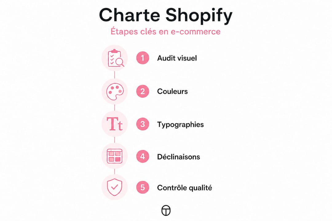
3. Adapt it for each Shopify platform Create specific rules for the theme, product pages, collections, checkout, pop-ups, and transactional emails. Also consider seasonal banners and landing pages for your campaigns. Each platform has its own technical constraints and UX challenges.
4. Integrate the rules into the Shopify CMS Import your colors into the theme settings. Upload your fonts via dedicated integrations. Configure button, link, and heading styles. Use consistent sections and blocks to ensure that every new page automatically follows the style guide.
5. Implement ongoing monitoring The brand style guide is not a static document. Schedule quarterly visual audits, especially after each seasonal campaign or theme update. Designate someone on your team to be responsible for visual consistency.
Treating the brand style guide as an “execution framework” that describes the rules and use cases (formats, sizes, UI states, content) rather than just a color palette is the difference between an identity that lives and one that deteriorates over time.
Pro tip: Create a shared document (Notion, Google Drive, Figma) accessible to all stakeholders: the internal team, freelancers, agencies, and developers. This document should contain not only the rules, but also visual examples of good and bad usage. The more concrete it is, the more likely it will actually be used.
To go further in practical application, our articles on Shopify design examples and beauty UX best practices provide concrete guidelines for every design decision on your store.
Our experience: the brand style guide, an underestimated business driver
Since 2018, we have supported dozens of beauty and wellness brands in designing and redesigning their Shopify stores. And what still strikes us today is the direct correlation between the maturity of a brand's style guide and its commercial performance.
Contrary to popular belief, the brand style guide is not an aesthetic issue. It is a value perception issue. We have seen products of equivalent quality generate differences in average order value of 30 to 40% depending on the quality of their visual environment on Shopify. Digital visual packaging plays the same role as physical packaging in a store: it positions the product in a value category even before the customer reads the description.
Another phenomenon we regularly observe: brands that invest in a rigorous style guide see their return rates and customer service inquiries related to “products different from what I imagined” decrease significantly. Why? Because graphic consistency reduces the gap between the visual promise and the perceived reality of the product. The customer buys with confidence and receives what they had imagined.
Customer loyalty follows the same pattern. A visually consistent brand is a memorable brand. And a memorable brand is one that the customer naturally returns to.
Our conviction, forged on the ground with these ambitious brands: treat your brand style guide as a central pillar of your commercial strategy, just like your product offering or pricing policy. The most effective beauty e-commerce solutions we build for our clients always rest on a solid, consistent, and documented visual identity.
Get expert guidance to create a successful visual identity
You now have a clear vision of what a brand style guide is and what it can bring to your Shopify store. The real question is: are you sure yours is up to the task of meeting your commercial ambitions?

At Tamara Agency, we have been helping beauty and wellness brands create and redesign their Shopify stores since 2018, using an approach that treats visual identity as a performance driver, not a final detail. Whether you are starting from scratch or want to redesign an existing identity, our team helps you design, document, and deploy a visual style guide that attracts and converts. Discover our beauty Shopify store creation services and our beauty Shopify training program to train your teams to apply it with excellence.
Frequently Asked Questions About E-commerce Visual Style Guides
What are the essential elements of an e-commerce visual style guide?
An effective visual style guide includes the logo and its variations, the color palette with exact codes, typography, iconography, and application rules for all digital and print materials. Without these documented foundations, maintaining the visual consistency of your store over time will be difficult.
Why is a Shopify store's visual style guide crucial for conversion?
Visual consistency in e-commerce ensures a seamless visual experience that reassures the customer, strengthens brand recall, and reduces friction at every step of the customer journey, from the homepage to checkout. An inconsistent experience, even at a single touchpoint, can be enough to cause cart abandonment.
Who should create and maintain the visual style guide in an e-commerce team?
The style guide is generally designed by the marketing manager or a specialized agency, but maintaining it is a collective responsibility: every employee, freelancer, or service provider working on the brand must consult and follow it. It must evolve with the brand, especially during repositioning or the launch of new product lines.
How do you practically apply a visual style guide on Shopify?
Import your colors and typography into the Shopify theme settings, configure component styles (buttons, forms, headers), and prepare a shared execution reference describing the rules and use cases for each format, size, and UI state. This reference must be accessible to the entire team to ensure consistent application over time.