


E-commerce UX Analysis: Boost Shopify Conversion
TL;DR:
- A UX analysis helps identify and correct friction points to increase conversion.
- Mobile-first optimization, loading speed, and a simplified checkout are essential in beauty.
- Regularly measuring impact with KPIs ensures continuous and sustainable improvement.
You’ve invested in magnificent visuals, impeccable product formulas, and a carefully crafted brand identity. Yet, your conversion rate is stagnating. This scenario is far more common than one might think in the beauty and wellness sector. The reality is simple: a site must perform as well as it attracts. UX (User Experience) analysis is precisely the tool that reveals why your visitors leave without buying, where the friction in their journey lies, and how to transform every page into a conversion lever. This guide explains the method, steps, and measurable results of an effective UX analysis on Shopify.
Table of Contents
- Understanding UX Analysis in E-commerce
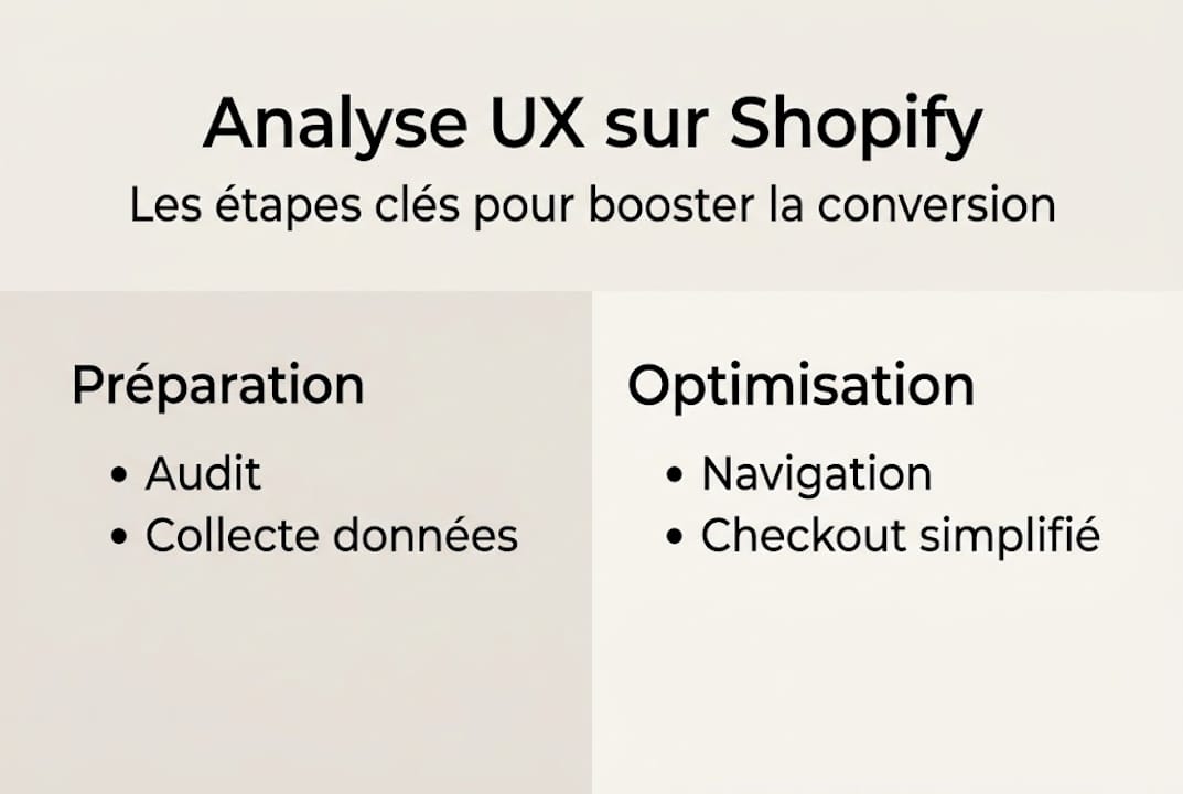
- Key Steps for an Effective UX Analysis on Shopify
- Main Areas for UX Improvement on Beauty Stores
- Measuring the Concrete Impact of UX on Conversion
- What Most Brands Miss in Their UX Analysis
- Optimize Your Beauty Store's UX with Tamara Agency
- Frequently Asked Questions about E-commerce UX Analysis
Key Points
| Point | Details |
|---|---|
| Clear Definition | UX analysis reveals the real obstacles to conversion on Shopify. |
| Structured Method | Following each step of the UX analysis helps optimize the customer journey. |
| Measurable Impact | UX gains are measured by conversion rate and customer engagement. |
| Mobile Focus | Mobile optimization is crucial for the beauty sector in 2026. |
| Continuous Improvement | UX must be managed with regular feedback to remain effective. |
Understanding UX analysis in e-commerce
To fully grasp why UX can be decisive, we must first understand the fundamentals and what a UX analysis in e-commerce evaluates.
UX analysis, or user experience audit, is the systematic study of a visitor's journey on your online store. It identifies every point of friction: a slow page, a poorly positioned button, an overly long checkout funnel. Its objective is concrete: to maximize conversion, reduce cart abandonment, and retain demanding customers.
In the beauty and wellness world, these stakes are amplified. Your customers buy with their eyes, emotions, and trust. A poor loading experience or a complex checkout is enough to break that trust in a few seconds. The best beauty UX practices on Shopify show that visual experience and journey fluidity are inseparable in this sector.
A comprehensive UX analysis on Shopify covers several essential dimensions:
- Loading speed: Core Web Vitals (Google metrics) measure perceived user speed
- Mobile optimization: over 70% of e-commerce beauty visits come from a smartphone
- Navigation path: clarity of categories, accessibility of flagship products
- Checkout funnel: number of steps, required fields, payment options
- Reassuring content: customer reviews, guarantees, detailed descriptions
The Shopify UX/UI guide emphasizes that a technical audit is the basis of any serious UX approach. Without reliable performance data, decisions remain assumptions.
"The UX audit analyzes speed, mobile, and payment simplification on Shopify." An optimized checkout process is often the first lever identified during an audit.
What we retain: UX analysis is not an aesthetic audit. It is a rigorous reading of user behavior, translated into concrete actions to grow your brand.
Key steps for an effective UX analysis on Shopify
Having established the definition, let's look at how a UX analysis adapted to Shopify for beauty products is actually carried out.
A serious analysis follows a logical order. Each step feeds the next and allows prioritizing actions according to their potential impact on conversion.
-
Technical and speed audit: measurement of Core Web Vitals via Google PageSpeed Insights and native Shopify tools. A product page that takes more than 3 seconds to load typically loses a significant portion of its visitors before they even see the product. The Shopify performance checklist is a useful starting point for structuring this audit.
-
Mobile journey analysis: simulate the experience on different devices, test text readability, call-to-action button sizes, and scrolling fluidity. The importance of mobile in beauty is now a non-negotiable factor.
-
Navigation mapping: identify pages with high bounce rates, analyze the most common paths, ensure flagship products are accessible in a maximum of three clicks.
-
Checkout optimization: this is often where most conversions are lost. Mobile-first checkout optimization recommends limiting fields to a maximum of 6 to 8. Beyond that, each additional field increases the risk of abandonment.
For beauty stores, A/B testing plays a key role at this stage. Testing two versions of an "Add to Cart" button (color, text, position) can generate measurable conversion gains in a few weeks. Product images also carry considerable weight: a well-chosen lifestyle photo often outperforms a classic packshot visual in terms of engagement.
Pro tip: always think mobile-first when it comes to UX. Design your journey for the smallest screen, then adapt it for desktop. In the beauty sector, this approach alone can significantly improve your conversion rate.
Main areas for UX improvement on beauty stores
Once the methodology is understood, let's see where to focus efforts to achieve a real business impact.
A UX audit almost always reveals the same broad categories of problems in beauty stores. Correcting them in order of their impact allows you to proceed methodically.
Intuitive navigation: reduce the number of steps between the homepage and the product page. An overly cluttered menu is discouraging. Clear filters (skin type, benefit, range) guide the user to what they need effortlessly.

Reassuring visuals and content: in beauty, trust is built through images, reviews, and guarantees. An example of a beauty user journey illustrates how social proof (reviews, before/after results) reduces purchase hesitation.
Simplified checkout: reducing fields to 6 to 8 on the payment page directly improves conversion. Offering options like Shop Pay or Apple Pay further reduces friction.
Effective micro-interactions (subtle hover animations, visual cart addition confirmations) also enhance engagement without cluttering the interface.
Good beauty UX practices also emphasize visual consistency: a well-controlled color palette, legible typography, and airy spaces signal the care taken with the brand.
"User experience is the silent reflection of your brand values. Every perceived friction is a missed opportunity to create a connection."
| Indicator | Before Optimization | After Optimization |
|---|---|---|
| Loading Time | 4.8 seconds | 2.1 seconds |
| Conversion Rate | 1.2 % | 2.6 % |
| Cart Abandonment Rate | 74 % | 58 % |
| NPS Score | 32 | 51 |
| Mobile Bounce Rate | 68 % | 44 % |
These figures illustrate the real impact of a well-executed UX approach on a Shopify beauty store. The gains are not anecdotal: they transform the profitability of a store.
Measuring the concrete impact of UX on conversion
Identifying areas for improvement is not enough: measuring the actual impact is the key to a results-oriented approach.
UX optimization without rigorous monitoring is like sailing without a compass. To know if your changes are working, you need to define your KPIs (Key Performance Indicators) even before you start making changes.
Here are the four priority KPIs to monitor after a UX audit:
- Overall conversion rate: proportion of visitors who complete a purchase. This is the most direct indicator of your UX's effectiveness.
- Cart abandonment rate: percentage of sessions with a cart created but no completed purchase. UX optimization significantly reduces cart abandonment when it targets the checkout.
- Average navigation time: too short can mean a quick departure, too long can indicate friction in the journey.
- Customer satisfaction (NPS or post-purchase reviews): a qualitative indicator that complements quantitative data.
The UX challenges in beauty show that the correlation between user satisfaction and loyalty is particularly strong in this sector. A customer who has a smooth experience returns and recommends.
| KPI | Before | After 1 month | After 3 months |
|---|---|---|---|
| Conversion Rate | 1.2 % | 1.9 % | 2.6 % |
| Cart Abandonment | 74 % | 64 % | 58 % |
| Loading Time | 4.8 s | 2.5 s | 2.1 s |
| NPS | 32 | 43 | 51 |
Shopify solutions for beauty allow you to integrate tracking tools directly into your store's ecosystem, without complex configuration.
Pro tip: don't just measure the immediate results after deployment. Some UX gains manifest over several weeks, particularly through digital word-of-mouth and organic returns. Analyze your KPIs at 30, 60, and 90 days to get a reliable view.
What most brands miss in their UX analysis
We observe it regularly: beauty brands treat UX auditing as a task to check off, not as a culture to embed. They conduct an audit, correct a few technical points, and then move on. This is precisely where the most costly mistake lies.
UX is not a one-off project. It's a living process, fueled by customer feedback, behavioral data, and the evolution of your offerings. In the beauty sector, expectations evolve quickly: new trends, new formulas, new purchasing habits. Your UX must keep pace with this rhythm.
Beauty branding and UX are also inseparable. A strong identity poorly translated into a digital experience loses all its value. The authenticity you convey in your products must be felt in every interaction on your store: a well-placed button, a warm confirmation page, a human error message.
Brands that win in the long term are those that create a continuous improvement loop: audit, test, measure, adjust. Not once, but constantly.
Optimize your beauty store's UX with Tamara Agency
Ready to take the next step? Our experts will help you translate these methods into concrete results for your Shopify store.
Since 2018, we have been supporting ambitious beauty and wellness brands in their Shopify beauty redesign and UX optimization projects. Our approach is tailor-made: performance audit, UX/UI redesign, checkout simplification, and monthly KPI monitoring. Every recommendation is rooted in the reality of your sector and your audience.

Whether you are starting a first audit or looking to completely redesign your user experience, our e-commerce UX services are designed to support you every step of the way. We also offer Shopify UX training so your teams can independently manage optimization. Let's talk about your project.
Frequently asked questions about e-commerce UX analysis
What tools should be used for a UX analysis on Shopify?
The main tools are Google Analytics, Hotjar for heatmaps, and Core Web Vitals speed audits for technical performance. These three sources cover the essential behavioral and technical data.
How long does it take to see the impact of UX optimization?
Initial results are often observed within a few weeks of deployment, but a reliable view requires monitoring over 30, 60, and 90 days to distinguish sustainable trends from temporary variations.
Why limit the number of fields during checkout?
Reducing the number of fields to 6 to 8 simplifies the purchasing process and reduces cart abandonment: each additional field represents a potential obstacle between the intention to purchase and the final conversion.
Should mobile UX be adapted differently for beauty?
Yes, because the majority of beauty purchases are made on mobile, with strong expectations for fluidity and visual trust. Mobile-first optimization on Shopify is therefore an absolute priority for this sector.