

Examples of Standout Cosmetic Branding
TL;DR:
- Cosmetic brands that dare to break away from conventional codes attract more attention and build greater credibility. Successful branding must be consistent, sensory, and authentically told across all touchpoints. Atelier Brune and Yves Rocher illustrate two complementary approaches, combining sensory experience with evidence-based storytelling.
In an industry where hundreds of brands share the same visual codes—clinical white, understated gold, minimalist typography—examples of truly memorable cosmetic branding are rare. Yet it is precisely these bold brands that capture attention, build customer loyalty, and create lasting value. This article breaks down the criteria for successful cosmetic branding, analyzes two real-world examples, and offers recommendations you can apply directly to your brand.
Table of Contents
- Key Takeaways
- 1. The Essential Criteria for Successful Cosmetic Branding
- 2. Atelier Brune: Sensory, Differentiating Branding
- 3. Yves Rocher Rouge Botanique: Heritage and Performance
- 4. Comparing the Two Branding Approaches
- 5. Practical Tips for Adapting These Examples to Your Brand
- What I Learned Working with Cosmetic Brands
- Your Shopify Store Must Reflect Your Branding with the Same Level of Care
- FAQ
Key Takeaways
| Key Point | Details |
|---|---|
| Consistency across all touchpoints | The logo, color palette, typography, and packaging must form a unified, recognizable visual system. |
| Breaking away from expected visual codes | A sensory, bold aesthetic helps your brand stand out in a saturated market. |
| Combining evidence and storytelling | Pairing efficacy data with emotional storytelling enhances desirability and credibility. |
| Omnichannel customer experience | Branding must be as strong in physical stores as it is across digital platforms. |
| Authenticity as a foundation | Consumers in 2026 can spot inauthenticity. Branding that embodies authenticity builds lasting trust. |
1. The Essential Criteria for Successful Cosmetic Branding
Successful cosmetic brand branding is built on a complete identity: a logo, color palette, typography, visual universe, and consistent packaging. It is not a checklist of elements. It is a system in which each component strengthens the others.
Here are the pillars to master before launching or rebranding your identity:
- Defined color palette: choose 3 to 5 colors that evoke your brand positioning, not those of your category. A sensitive skincare brand is not destined to use only white and green.
- Expressive, consistent typography: one primary typeface for headings and a secondary one for body text. Typographic consistency is often the first thing sacrificed—and the first thing noticed when it is missing.
- Narrative visual universe: photography, illustrations, textures, and patterns must tell the same story. Your Instagram and packaging should look alike without copying each other.
- Packaging designed as a medium: packaging is your first physical touchpoint. It must communicate your positioning in less than three seconds.
- Complete sensory consistency: according to beauty branding trends for 2026, sensory appeal and authenticity are far outpacing traditional clinical codes.
For organic brands, a simple green color scheme is no longer enough. Merchandising must embody the organic nature of the brand through store layout, signage, and a relevant customer experience at every touchpoint.
Pro tip: Before developing your visual identity, write a one-page brand platform: your mission, values, promise, and tone of voice. Every design choice should stem from this document.
2. Atelier Brune: Sensory, Differentiating Branding
Atelier Brune is one of the most compelling examples of cosmetic branding in recent years. The brand offers anhydrous natural cosmetics for sensitive skin, a category often treated with cold, medicalized visual codes. Atelier Brune took the opposite approach.
The branding for Atelier Brune deliberately avoids clinical codes to reassure people with sensitive skin without alarming them. The result: a warm, mineral identity that feels almost tactile even before you open the bottle.
The strengths of this identity:
- Palette inspired by mineral materials: earth, clay, and ochre. Colors that evoke nature without falling into the cliché of a “green leaf on a white background.”
- Expressive, consistent typography: a typographic choice that combines character and readability, signaling both creativity and the seriousness of the skincare.
- Ritual-focused universe: the visuals do not show a product. They show a gesture, a texture, a moment. This is the storytelling that creates desire.
- Consistent deployment across all touchpoints: packaging, website, and social media all carry the same aesthetic signature.
“Complete sensory consistency, combining typography, textures, and packaging and digital deployment, is the real driver of compelling cosmetic branding.”
What sets Atelier Brune apart is the education integrated into the branding. Every visual element explains without having to say a word: the materials evoke naturalness, the warmth of the tones is reassuring, and the simplicity of the packaging signals the concentration of the formulas. The branding does the work of persuasion before the consumer reads a single line of text.
3. Yves Rocher Rouge Botanique: Heritage and Performance
While Atelier Brune illustrates a purely sensory approach, Yves Rocher Rouge Botanique demonstrates that a brand with 60 years of history can renew itself without betraying its roots. It is a valuable example of cosmetic branding and marketing for established brands looking to modernize their image.
The relaunch of Rouge Botanique combines historical heritage and cosmetic innovation with remarkable precision. Here is what this campaign teaches:
- Evidence-based storytelling: proven efficacy, with 52% more hydration in laboratory tests, becomes an emotional argument as well as a rational one. It is not just a figure on a product page. It is the promise of visible skincare.
- Inclusivity as positioning: 37 shades and 3 finishes. This choice is not incidental. It signals that the brand is for everyone, not just a single ideal.
- Recyclable, desirable packaging: the challenge was to make the purchase eco-friendly without sacrificing desirability. Rouge Botanique succeeds by maintaining elegant packaging while communicating its recyclability commitments.
- Olfactory and textural signature: the sensory appeal of the product is integrated into the brand story. The user experience becomes a selling point.
Yves Rocher perfectly illustrates how to tell the story of evidence to enhance desirability without sacrificing visual appeal. Too many brands make the opposite mistake: they display figures without wrapping them in a story. The result looks like a clinical study, not a beauty product.
4. Comparing the Two Branding Approaches
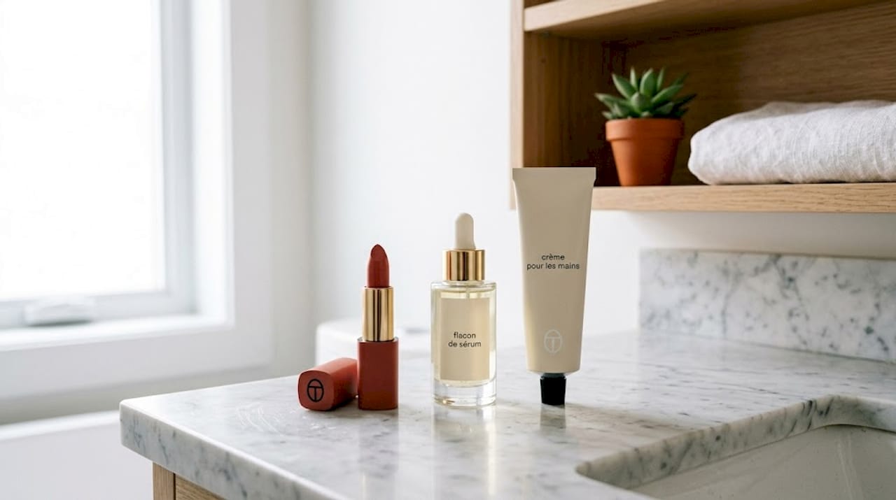
These two cases illustrate distinct but complementary cosmetic branding strategies. The following table helps you identify which one best suits your situation.
| Dimension | Atelier Brune | Yves Rocher Rouge Botanique |
|---|---|---|
| Positioning | Niche brand, sensory skincare, sensitive skin | Mass-market brand, heritage and innovation |
| Dominant aesthetic | Mineral, warm, artisanal | Botanical, elegant, inclusive |
| Main driver | Sensory experience and ritual | Scientific evidence and storytelling |
| Target audience | Committed, curious consumers | Broad audience, loyal and new customers |
| Strength | Strong aesthetic differentiation | Reassurance through evidence and heritage |
| Area for caution | Less accessible to the general public | Risk of dilution if there are too many extensions |
Atelier Brune’s sensory approach fosters deep loyalty within a committed community. Yves Rocher’s heritage and performance approach maximizes reassurance on a large scale. 2026 beauty trends also highlight that the two directions are converging: authenticity, sensory appeal, and peer recommendations are now defining the brands that win.
Pro tip: If your brand is new, a sensory approach is often more accessible and differentiating. If you have a product history, capitalize on your efficacy data by wrapping it in a compelling visual story.
5. Practical Tips for Adapting These Examples to Your Brand
Analyzing successful branding stories is only valuable if you can turn them into concrete actions. Here is a six-step method for applying these lessons to your own brand.
-
Define your brand platform. Before doing any design work, write down your mission, promise, values, and the tone of voice that reflects you. This platform is your compass.
-
Choose a palette that tells a story, not one that simply feels safe. Avoid copying the dominant colors of your category. Ask yourself what emotion you want to evoke, then find the colors that embody it.
-
Build a consistent typographic system. Two typefaces are enough. The first expresses your personality, while the second ensures readability. Apply this system consistently across all your touchpoints.
-
Integrate evidence into your storytelling. If you have clinical results, user tests, or certifications, do not bury them in a technical data sheet. Integrate them into your visual and verbal narrative, just as Yves Rocher does.
-
Think of packaging as your first salesperson. Well-designed beauty packaging communicates your positioning without saying a word. Test your packaging with people who do not know your brand and ask them what they feel.
-
Deploy your branding intentionally at the point of sale. This is especially true for organic or natural brands: a thoughtful physical presence with greenery and a visible purchasing area significantly enhances brand perception. Digital and physical experiences must complement each other.
To learn more about structuring your visual identity, BrandPower’s guide to brand identity offers a European methodology applicable to the cosmetics industry. And if you want to understand how your branding translates into performance on TikTok, the analysis of the role of identity on TikTok remains a useful read for brands building their social presence.
What I Learned Working with Cosmetic Brands
Working with beauty and cosmetic brands for years has confirmed one thing: the most memorable branding is never the kind that tries to please everyone.
I have seen brands with exceptional products fail because their visual identity conveyed nothing in particular. And I have seen others with more modest formulas build a strong community simply because their branding created a consistent, recognizable experience at every touchpoint.
What strikes me about the most successful cosmetic branding examples is the clarity of intent. Atelier Brune decided not to look like other sensitive skincare brands. This decision alone guided every design choice. Yves Rocher decided not to sacrifice desirability on the altar of scientific evidence. Both approaches are simple, but they require courage.
What I recommend to every founder or marketing manager I work with: ask yourself this question before any creative brief. “If we removed our logo from this visual, would anyone know it is ours?” If the answer is no, the work is not finished. A solid branding strategy is not just a beautiful logo. It is a system that is recognizable even without a signature.
— Tamara
Your Shopify Store Must Reflect Your Branding with the Same Level of Care
Strong cosmetic branding loses its power if your online store does not faithfully reflect it. A poorly constructed product page, confusing navigation, or generic design can erase months of work on your brand identity in just a few seconds.
At Tamaragency, we create Shopify stores for cosmetics that serve your branding as effectively as they convert. Every project begins with a deep understanding of your identity, values, and target audience. The result: a user experience that naturally extends your brand universe. If you want to take your strategy further, our Shopify consulting will help you align branding with commercial performance. A website should perform as well as it appeals.
FAQ
What Is Good Cosmetic Branding?
Good cosmetic branding is a consistent system that includes a logo, color palette, typography, packaging, and visual universe, and that conveys a recognizable identity across all touchpoints, from digital platforms to the point of sale.
How Can You Differentiate Your Branding in the Cosmetics Industry?
Choose an aesthetic that stands out from the dominant codes of your category: an unexpected color palette, a narrative universe focused on ritual or sensory experience, rather than generic clinical codes.
Should Cosmetic Branding Include Scientific Evidence?
Not necessarily, but if you have them, incorporate them into your storytelling rather than relegating them to a technical data sheet. Yves Rocher shows that a figure well-integrated into a narrative becomes an argument for desirability, not just credibility.
What are the beauty branding trends in 2026?
The 2026 trends favor authenticity, sensoriality, inclusivity, and peer recommendations. Clinical codes are giving way to warmer, more embodied, and narrative identities.
What budget to plan for a cosmetic branding overhaul?
The budget varies greatly depending on the depth of the work: from a few thousand euros for a complete visual identity at a boutique agency, to several tens of thousands for a global repositioning including packaging, digital, and internal training.